
+220% enquiry growth
Corporate Platform Refresh
Rebuilt a dated corporate website into a faster, clearer lead-generation platform with stronger trust signals and better navigation.
CorporateNext.jsLead Gen
UI Design Preview - WealthPath Dashboard
Component Library - 200+ Components
Button
Input
Card
Badge
Design Tokens - Colour System
Every State Was Designed
Developer Handoff - Always Included
Named layers · Exported assets · Design tokens · Annotated specs · Handoff session · Figma Inspect ready

Greenhood Kids School
Client

KKR Linens & Fabrics
Client

ROBOT PK Innovation
Client

UpTrust Karur
Client

Faaloon Coliving & Roomstays
Client

Tena Healthcare
Client
.png)
JCOM (Jaycees Chamber of Commerce)
Client

JCI Karur Diamond
Client

PVA
Client

VK Pulmo Care
Client

Popular Gifts & Toys
Client

Caseyug Innovation
Client

AJ Kidz World
Client

Arjuna World Records
Client

Thadam 360
Client

Witty Technologies
Client

Khadim
Client
Slings Park
Client
The Salary Spot
Client

Crazy Weaves
Client

PALANIMURUGAN TEXTILES
Client

Karur Shawarma
Client

Knot Coaching & Consulting
Client

Cream n Flavours
Client

Mini Bharat Courier & Logistics
Client

Ayurillam
Client

Veandhan Builders
Client
Greenhood Kids School
Client
KKR Linens & Fabrics
Client
ROBOT PK Innovation
Client
UpTrust Karur
Client
Faaloon Coliving & Roomstays
Client
Tena Healthcare
Client
JCOM (Jaycees Chamber of Commerce)
Client
JCI Karur Diamond
Client
PVA
Client
VK Pulmo Care
Client
Popular Gifts & Toys
Client
Caseyug Innovation
Client
AJ Kidz World
Client
Arjuna World Records
Client
Thadam 360
Client
Witty Technologies
Client
Khadim
Client
Slings Park
Client
The Salary Spot
Client
Crazy Weaves
Client
PALANIMURUGAN TEXTILES
Client
Karur Shawarma
Client
Knot Coaching & Consulting
Client
Cream n Flavours
Client
Mini Bharat Courier & Logistics
Client
Ayurillam
Client
Veandhan Builders
Client

BNI
Client

HAP Daily
Client

Sri Ram Decors
Client

G Graphics Media
Client

NKV Trading Messenger
Client

Triumph
Client

STS Surface Finishing Solution
Client

Supreme Security Solution
Client

Jamex Co. Ltd
Client

Supreme Security
Client

Mercury Steel World LLP
Client

Cozo Holidays
Client

JKS Ads & Promo
Client

Airtel Fibre
Client

Aakash Institute
Client

Hatsun
Client

Naturals
Client

Nilco
Client

Volga
Client

Joy Tours and Travels
Client

Jega Mattress World
Client
Fix 2 Fit
Client

Pramo Careers
Client

Zeen’s Makeup
Client
edio.in
Client

Ile Televisions
Client
BNI
Client
HAP Daily
Client
Sri Ram Decors
Client
G Graphics Media
Client
NKV Trading Messenger
Client
Triumph
Client
STS Surface Finishing Solution
Client
Supreme Security Solution
Client
Jamex Co. Ltd
Client
Supreme Security
Client
Mercury Steel World LLP
Client
Cozo Holidays
Client
JKS Ads & Promo
Client
Airtel Fibre
Client
Aakash Institute
Client
Hatsun
Client
Naturals
Client
Nilco
Client
Volga
Client
Joy Tours and Travels
Client
Jega Mattress World
Client
Fix 2 Fit
Client
Pramo Careers
Client
Zeen’s Makeup
Client
edio.in
Client
Ile Televisions
Client
Most teams think poor results come from the product. But many times, the real problem is the interface. A product can be strong, well-priced, and useful - but if users can’t find what they need, don’t understand the value, or get confused about what to do next, they leave.
On the same EdTech platform, course completion can go from 22% to 68% just by improving the interface and making users come back daily. In healthcare apps, booking success can increase just by reducing steps - like asking for 6 details instead of 14. These are not product problems, they are interface problems.
UI design here is done with a clear goal - improve completion, reduce drop-offs, and make actions simple. Design is not just about looks. It is about helping users take action easily.
What a UI Design Engagement Covers - Click Each Layer
Information Architecture
This is how the product is organised. It decides how users move and find things inside the app.
Key Decisions at This Layer
Commercial Impact
If structure is wrong, users get confused. No design can fix that later.
Visual Design System
Component Library
Interaction & Prototype
What Is Delivered in a UI Design Engagement
Wireframes & User Flows
We first plan every screen in simple wireframes. This helps map user flow, content order, and actions before moving to design.
High-Fidelity UI Design
Clean and detailed UI screens are designed in Figma. All states like hover, error, loading are covered for every screen.
Design System & Component Library
Reusable components like buttons, inputs, and cards are created so future screens stay consistent and easy to build.
Responsive & Adaptive Design
Designs are created for mobile, tablet, and desktop. Everything adjusts properly for different screen sizes.
Developer Handoff - Figma Inspect
Design files are ready for developers with proper naming, spacing, and assets. Easy to build without confusion.
Prototype & Interaction Design
Clickable prototypes are created to show how the app works before development starts.
Poor UI shows up as high bounce, low conversion, and inconsistent screens. Click to see the difference.
Conversion Rate
Before
Users don’t know what to click
After
Clear main action always visible
Developer Efficiency
Before
Incomplete designs, confusion during build
After
Clear Figma files with all details
Design Consistency
Before
Different styles on every screen
After
Same components used everywhere
Mobile Experience
Before
Desktop design squeezed into mobile
After
Mobile-first design approach
User Trust
Before
Low-quality design reduces trust
After
Professional UI builds trust
Industries Where UI Design Has Been Delivered
E-Commerce & D2C
68 projects
Fintech & Banking
54 projects
Healthcare & MedTech
41 projects
EdTech & E-Learning
38 projects
SaaS & Enterprise
62 projects
Food & Hospitality
27 projects
Wellness & Fitness
33 projects
Real Estate & PropTech
29 projects
Three UI projects are shown below - each focused on solving a real problem, the design choices made, and the results after launch.
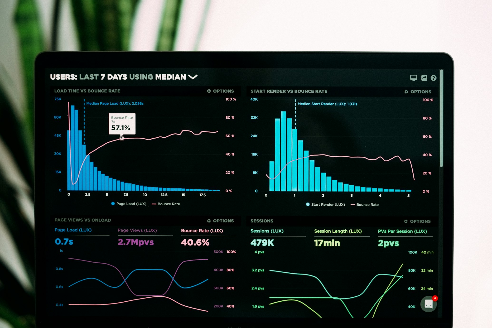
Personal Finance & Investing · 8 weeks · 2025
WealthPath - Fintech Dashboard That Grew Active Users by 3.2×
The app was built step by step without a design system. Spacing, colors, and components were inconsistent. Users were dropping off during signup - 68% left at step 3. The redesign also had to be done carefully without disturbing existing users.
We first created a proper design system - colors, typography, spacing, and 200+ components. Then we redesigned onboarding using simple steps so users don’t feel overloaded. The dashboard was simplified to show only important data. All screens were built in Figma with dark mode and clear developer handoff.
Measurable Outcomes
3.2×
Active users increased
68%→21%
Onboarding drop reduced
200+
Components created
Dark mode
Full system added
Tools Used
"Before redesign, our onboarding drop was 68%. After redesign, it came down to 21%. We didn’t change features, we changed the interface. That made the real difference. Within 6 months, users grew 3.2×."
Karthik Subramaniam
CTO, WealthPath Investments
A few representative website builds focused on performance, conversion, and long-term scalability across different business models.
Rebuilt a dated corporate website into a faster, clearer lead-generation platform with stronger trust signals and better navigation.

Optimized product discovery, mobile UX, and checkout flow for an online store serving high-intent traffic.

Created a structured education platform with clear program journeys, enquiry capture, and admin-friendly content flow.
This process follows five clear steps - structure first, then screens, then delivery. Without a system, designs become inconsistent over time.
01
We first check the existing product or idea - find problems, confusion points, and what needs fixing. Then we clearly define what screens and flows will be designed.
02
We sketch simple wireframes first - to decide layout, structure, and user flow before adding colors or visuals.
03
We create the base system first - colors, fonts, spacing, and components. Everything else is built on this.
04
We design final screens using the system - including all states, responsive views, and proper accessibility checks.
05
We prepare Figma files for developers - with clean structure, tokens, assets, and clear instructions for implementation.
Every design choice is based on real goals like conversion, clicks, or user completion - not just how it looks.
We build the design system first so everything stays consistent. Without this, the UI becomes messy over time.
Figma files are clean and ready for developers - with proper naming, tokens, assets, and clear structure.
We design for mobile first - with proper touch spacing, simple navigation, and easy user flow.
We include accessibility from the start - good contrast, readable text, and proper focus states.
Clear pricing for each level - what you get, what you don’t, and when to choose it. Click to see full details.
Right for: Products that are launching or being redesigned - where full UI needs to be ready for engineering and real users.
What Is Included
What Is Not Included
All pricing is indicative and varies by product complexity, screen count, and platform scope. A free project scoping call is available - a recommended tier and a tailored quote will be provided within 3 business days.
Book a free UI call - we’ll review your product, metrics, and current design, and suggest the right approach and timeline within 3 days.
Free · No obligation · Scope in 3 business days · NDA available · All Figma source files transferred on completion